How to optimize your website's images: size, format and loading
Translated from the Spanish original. Leer en español
Optimizing a website's images means delivering each photo with the dimensions, format and quality it needs, and loading it at the right moment. Reducing file weight helps, but a small image can also arrive late if the page delays its download.
The goal is to keep the detail that lets someone understand a photo, read a screenshot or judge a product, without sending unnecessary files. Good compression that erases that detail stops being a good solution.
In the previous Desayuno SEO we looked at how to write alt text. Today we cover another part of the job: preparing the file and checking what the browser actually receives.
What does it mean to optimize an image for the web?
It means adjusting three different things: the file, its presentation and its loading. Google recommends combining visual quality, speed and responsive image techniques, instead of treating optimization as a simple change of extension.
It helps to distinguish these measures:
- File dimensions: how many pixels wide and tall it contains.
- Displayed size: the space it occupies in the layout, measured in CSS pixels.
- File weight: how many bytes it needs to transfer.
A photo can occupy a narrow column and still keep thousands of pixels in the downloaded file. Making it small with CSS changes its appearance, but does not by itself turn the original into a lighter file.
A modern extension does not solve everything either. An oversized WebP image can still send more information than necessary. First you need to understand where it is used, then prepare its versions.
What size does each image need?
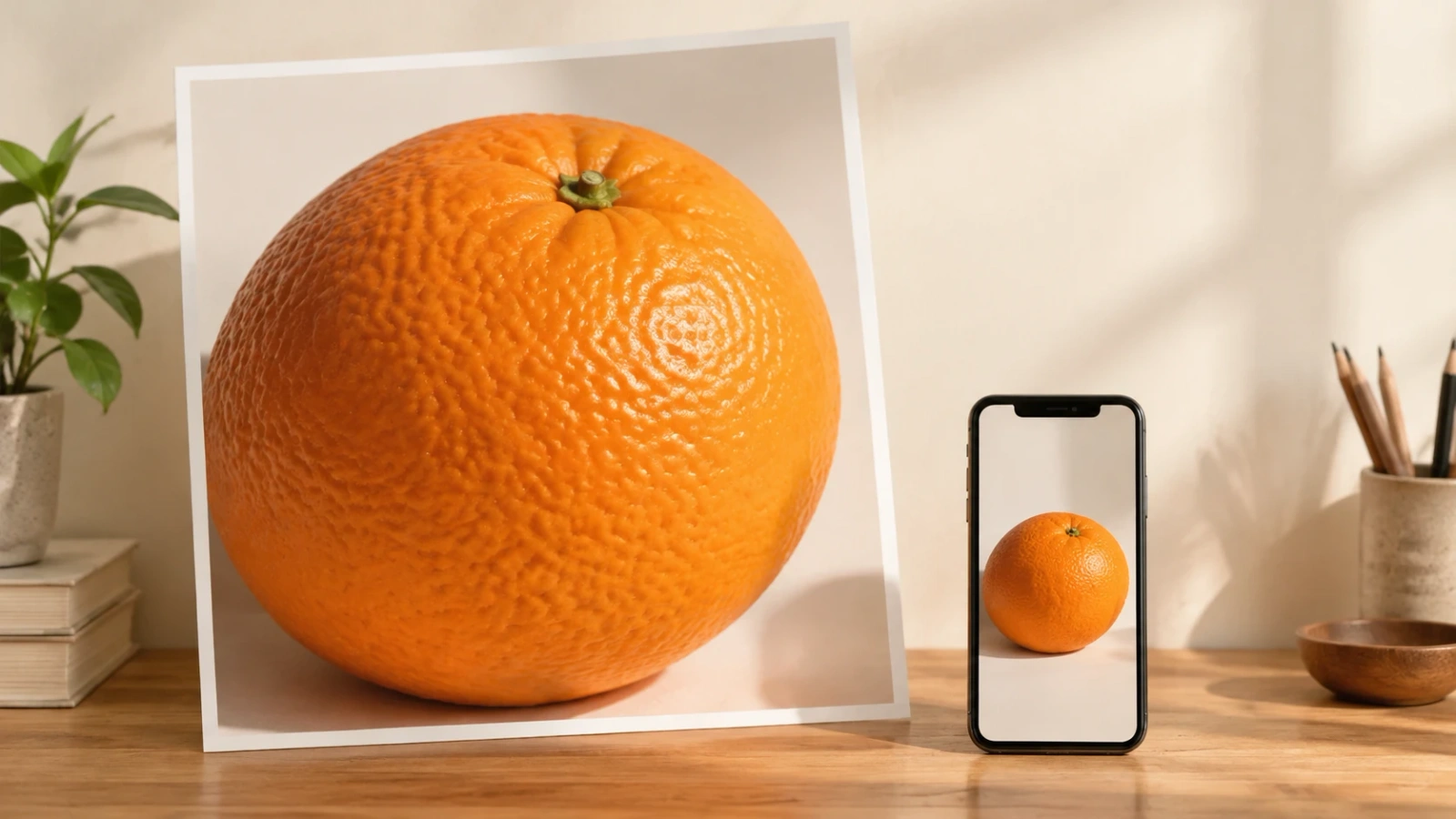
The size depends on the space where it is shown and the screen density. There is no single width valid for every image on a website. MDN explains that higher-density screens may need more image pixels to keep detail in the same visual space.
A hypothetical example: a photo is displayed at 400 CSS pixels wide. A density-2 screen can take advantage of a version around 800 pixels wide. That calculation helps you understand the relationship; it does not force you to always send the 800-pixel version, nor does it replace checking what the browser chooses.
Start by locating the image's real uses: cover, listing card, product photograph or support inside the article. If the same photo appears in several spaces, prepare several sizes from the original, not several copies with different names but the same dimensions.
Keep the original outside the publication so you can generate other versions. Enlarging a small image does not recover detail it never had. Cropping for mobile is also an editorial decision: the face, the product or the important part must stay inside the frame.
Add the width and height dimensions matching the image's aspect ratio. They do not prevent making it flexible with CSS. They help the browser reserve space before the file arrives, as web.dev explains about dimensions and layout shifts.
The reserved space matters even if the photo is compressed. If the text shifts when the image appears, the problem is not fixed by shaving off another ten kilobytes. That stability is part of what we review in the Core Web Vitals guide.
How do you choose between JPEG, PNG, WebP and AVIF?
Choose by comparing the content you need to keep, the resulting weight and your publication's compatibility. Google supports JPEG, PNG, WebP and AVIF, among other formats, for images included through compatible image elements. There is no need to convert everything to a single format out of habit.
JPEG is a common choice for photographs and uses lossy compression. It can work as a fallback when you need compatibility with systems that do not process other formats. It does not keep transparency.
PNG allows lossless compression and transparency. It can fit screenshots or images where letters and edges must stay precise. That does not mean it is always the lightest option for that content.
WebP supports lossy and lossless compression, plus transparency. It is a useful candidate for many photographs and web support images, but compare the export result; do not take the savings for granted before opening the file.
AVIF also allows lossy and lossless compression. It can produce small files with good quality; the result depends on the image and the settings. Check that your CMS, thumbnail generator and recipients support it before replacing existing files.
The MDN format guide details these differences. For icons and vector drawings, SVG is another category: there is no point automatically converting a vector logo into a photo to follow an export rule.
If you need several alternatives, the picture element lets you offer formats and leave a fallback image. The chosen format must match the file's real content. Renaming photo.jpg as photo.webp does not convert an image.
How do you compress an image while keeping useful quality?
Compressing means reducing the file while keeping what it needs to convey. Lossless compression keeps the image's information; lossy compression discards part of it to reach another balance between weight and quality. web.dev explains both and recommends checking the result, especially in letters and high-contrast edges.
The expression "without losing quality" needs context. If you use lossy compression, there can be changes even if they are not noticeable at publication size. What matters is not confusing an imperceptible difference with the disappearance of a detail the reader needs.
A simple working order:
- Start from the original and decide the crop.
- Generate the right dimensions for its uses.
- Export two or three format and quality candidates.
- Compare weight and appearance at publication size.
- Also review letters, textures and product details.
- Keep the candidate that preserves the information with less unnecessary load.
Compression tools do not share a universal quality scale. A value of 80 does not guarantee the same look or the same size in two formats or programs. Nor do you need to chase the smallest file at any cost: an illegible screenshot no longer does its job.
You can work with an editor, with an optimizer or with the CMS's own image system. The web.dev image performance documentation names Squoosh and ImageOptim among the options. If the site generates variants automatically, check what it publishes; do not assume that using a tool means it is well configured.
There is no universal kilobyte maximum that makes an image correct. A thumbnail and an expandable product photograph have different needs. Set the working limit after looking at the design, the required quality and the full set of resources the page downloads.

How do you deliver a suitable version to each screen?
By offering real alternatives and describing the space they will occupy. srcset lists candidate files; with width descriptors, sizes reports the intended displayed width according to the layout conditions. The browser uses that information to choose, as the MDN responsive images guide details.
The candidates must exist and their declared widths must be correct. If you announce a 480-pixel version and serve the same 2400-pixel original, the filename does not prevent the large download.
sizes is not a way to change the layout either. It explains the expected space to help choose the file. If a card occupies half a column on desktop, describing it as if it filled the whole screen can cause too large a choice.
So that Google can discover the image, keep a usable URL in the src attribute of the img element. Search Central recommends that fallback also when you use picture or srcset. An important image hidden only as a CSS background does not get the same treatment: Google states that it does not index CSS images.
The check is practical: open the same page with a narrow window and a wide one and see which file it requests. It is not enough to see the photo shrink. That only proves the layout adapts the displayed size.
Which images should you load first and which later?
Images visible on entry must be available without artificial delay. Those further down can use lazy loading. The distinction is not "cover versus interior", but what is initially visible and what role each image plays on that page.
The loading="lazy" attribute lets you delay images outside the initial view until they approach it. web.dev recommends not applying it to images visible at load, especially if one of them is the LCP element, the largest main content painted on screen.
A cover image is not necessarily the LCP of every page. A text block or another element can be. Check before touching priorities. If the image is the LCP, the LCP optimization guide recommends that it can be discovered early and is not lazy-loaded.
fetchpriority="high" can indicate that an important image deserves priority. It does not mean all of them should have it. Giving the same high priority to many images removes the usefulness of distinguishing the main one.
Removing lazy and raising priority do not compensate for every problem either. The image may wait for JavaScript to run, compete with other resources or take time to display after downloading. The diagnosis must separate when it starts being requested, how long it takes to arrive and when it is painted.
How do you check the result in PageSpeed and the browser?
Compare the same page and equivalent conditions before and after. Look at the chosen file, the transferred bytes, the start of the request and the quality the person sees. The overall score does not by itself explain whether you have fixed that image's problem.
In the browser tools, the network panel lets you locate image requests. A test with an empty cache helps check the first download. Then also review normal use with cache: they are different situations, not interchangeable results.
In PageSpeed Insights, distinguish lab data and real-user data. web.dev explains that the former helps investigate a specific load and the latter shows the experience collected under real conditions. A newly published change does not immediately transform user history.
Before considering the work done, review:
- The mobile version does not request an unnecessarily large original.
- The main image appears without improper lazy loading.
- The lower images do not all compete from the start unnecessarily.
- Space is reserved and the text does not jump when the photo arrives.
- Screenshots remain legible and the product keeps its details.
- Image URLs respond and the markup allows them to be discovered.
If the result is still slow, do not make the image the automatic culprit. The server, fonts, styles or JavaScript may be conditioning the load. An SEO audit must locate the bottleneck before recommending more compression.
What questions usually remain when optimizing images?
Does putting a photo in WebP improve its position in Google?
Changing the format can reduce weight if the export is right. It does not guarantee positions. Google combines technical requirements, context and page quality in its image recommendations.
Does alt text reduce the image's weight?
No. It describes its content or function according to the context. It is a different job from preparing the file, explained in the alt text guide.
Should I enable lazy loading on every image?
No. Reserve lazy loading for those outside the initial view. Delaying an LCP image adds a wait that web.dev recommends avoiding.
Can I delete the original after compressing?
It is worth keeping a working copy outside the publication. If you later need another crop or size, starting again from the original avoids depending on a version that already lost detail. It is an editing precaution, not a Google requirement.
To finish the coffee
Choose the dimensions, compare formats, adjust the compression and decide when to load each image. Then check the file the browser receives. That order avoids confusing a photo that is small on screen with a small download.
The best version is not the one that wins a kilobyte competition. It is the one that keeps what is needed to understand the page and arrives at the right moment.
Sources last reviewed: November 6, 2026.