Internal linking: choose the format by intent
Translated from the Spanish original. Leer en español
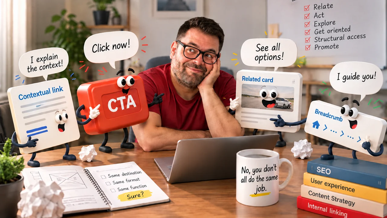
Text, CTA, card, breadcrumb or related block: each internal link serves a different function. How to choose the format before writing the anchor.
In brief
- An internal linking strategy doesn't end at "from where do I link, to where": you also have to decide how you link and what for.
- Contextual link, CTA, card, breadcrumb, related block, menu and footer are all internal links, but they don't pursue the same thing.
- There is no rule saying a text link is better for SEO than a button: a visual button can be a crawlable <a href> element.
- Before inserting a link, ask yourself what you want to achieve with it.
The question missing from audits
Auditing internal linking usually always starts the same way: which pages link, where they point and what anchor they use. It makes sense: it is measurable, it can be exported, filtered and dumped into a spreadsheet, which is where we SEOs deposit problems hoping that, for some reason, they become obedient.
What is almost never asked is why is that link presented that way? A text link inside a paragraph, a "See prices" button, a card, a breadcrumb or a block of related content can lead to another URL on the same site. All are internal linking. None tries to achieve the same thing.
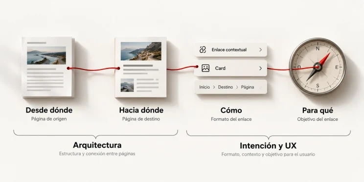
That is why the strategy is better understood with four questions: from where do I link → to where do I link → how do I link → what for. The first two talk about architecture; the last two, about intent.
Google uses links to discover pages and as a relevance signal, recommends descriptive, concise and relevant anchors, and reminds us that the words surrounding the link provide context (Google Search Central: link best practices). But the link doesn't exist only for Google: it also helps a person get oriented, go deeper, compare, discover an alternative or do something specific.
A case: a car rental landing page in Madrid
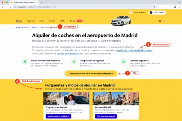
Imagine a transactional car rental landing page in Madrid. Inside that page we want to:
- explain the relationship with other content;
- make a booking or inquiry easier;
- show related destinations or categories;
- help the user understand where they are;
- allow access to other areas of the site.
We could link everything with blue text inside a paragraph. Technically it is possible, and also a fairly effective way to turn an interface into a town hall bulletin board in 2004. The question is not which URL I want to link, but what job I want that link to do. Let's look at each function.
One format for each intent
Expanding or relating an idea: contextual link
If the landing page explains traffic restrictions in Madrid and mentions the Low Emission Zone, there it makes sense to link to a specific guide on the LEZ. The user is already reading about that topic and the paragraph itself explains why that destination exists; besides, the anchor and its surroundings provide context to users and search engines. Careful: it doesn't mean Google rewards a link for being inside a paragraph, but that this format explains very well what relationship exists between source and destination.
Prompting an action: CTA
When the user has already looked at conditions, car types and pickup points, See prices or Search available cars appears. That link doesn't expand an idea: it facilitates an action. Here it is worth separating visual appearance from technical implementation. A button can perfectly be a crawlable <a href> element, and Google says that, in general, crawlable links must use an <a> element with an href attribute.
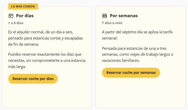
So there is no firm rule of the type text link = good for SEO // button = bad for SEO. The browser isn't impressed because the designer rounded the corners.
Showing alternatives: card
To offer other locations (Madrid Airport, Madrid Atocha, Madrid Chamartín) we could write three links in a row. A card lets you add a name, an image, a short description, an indicative price or some data that helps choose.
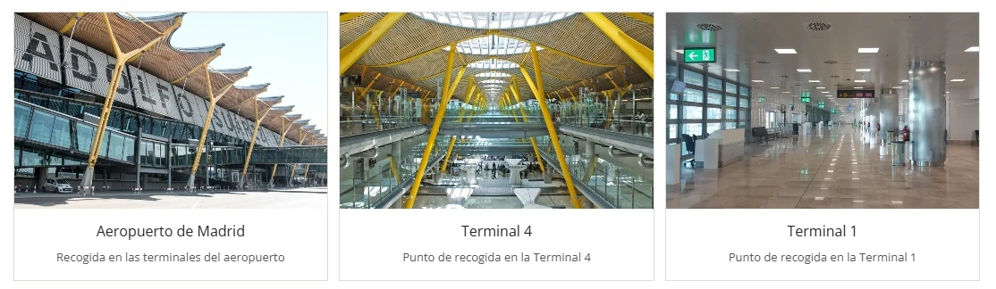
Nielsen Norman Group defines cards as brief representations of a unit of content that serve as an entry point to more detail (NN/g: Cards: UI-Component Definition). The card is not "better SEO": it better solves a specific need, exploring several comparable alternatives.
Explaining hierarchy: breadcrumb
Think of this path:
Home → Spain → Madrid → Terminal 4
It doesn't aim to sell or develop a concept: it helps understand where the page sits within the structure and to go up a level. Google describes breadcrumbs as a representation of a page's position within the site hierarchy (Google Search Central: Breadcrumb structured data).
Extending exploration: related content
At the end of the landing page we could show car rental in Toledo, Segovia and Ávila. That block doesn't have to compete with the main CTA: it opens side paths for users interested in nearby destinations. The key is that they are really related; filling a module with random links because there is a gap in the template is not strategy, it is decoration with URLs.
Menu and footer
The menu gives structural access to the important areas; the footer concentrates persistent or secondary access. They are part of internal linking, but they play another game. And here is an important idea: two links can point to exactly the same URL and serve different functions within the page. Counting links without understanding their function can fall short.
Quick map: intent and format
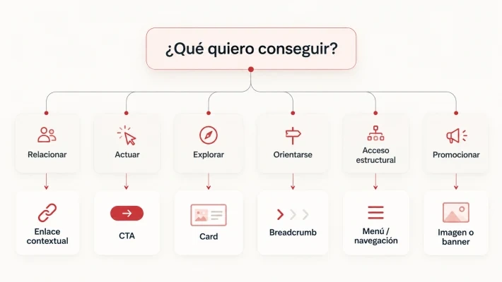
It is not a rigid equivalence table, but a way to avoid inserting links out of inertia.
| If you want... | What probably fits |
|---|---|
| Relate or explain | Contextual link |
| Prompt an action | CTA |
| Show alternatives | Card or related block |
| Represent hierarchy | Breadcrumb |
| Give persistent structural access | Navigation or footer |
| Highlight something visually | Image or banner, if it is clear that it is interactive and what its destination is |
If you cannot see all the columns, scroll the table sideways.
The anchor still matters, but it doesn't live alone
Google recommends anchors that are descriptive, reasonably concise and relevant to the linked page, and points out that the words before and after the link matter (Google Search Central: link best practices). That is why it is worth avoiding systematically generic anchors such as "see more", "here" or "more information". They are not forbidden; simply, in isolation they explain very little. Car rental at Madrid airport anticipates much better what the user will find.
With linked images there is another detail: Google can use the image's alt attribute as the link text. That makes alt more than a box to fill in five minutes before publishing because someone remembered it existed.
The type of page also changes the pattern
It doesn't make much sense to apply the same link pattern to all pages:
| Path | What usually works |
|---|---|
| From an informational article (blog post) to a commercial landing page | Introduce the link when the commercial solution makes sense within the content. A CTA every two paragraphs can turn a useful guide into a teleshopping commercial with an internet connection. |
| From one commercial landing page to another | Contextual links, cards or related modules, if they help compare locations, categories or alternatives. |
| From a category to products or services | Cards, because they let you show several comparable options. |
| From a detail page to alternatives | Related blocks to discover similar products, destinations or services. |
| To higher levels | Breadcrumbs and structural navigation. |
If you cannot see all the columns, scroll the table sideways.
The pattern changes because the need changes. If you are interested in seeing how transactional landing pages and local searches cross, look at local vs. transactional intent in car rental; and if a different URL from the one you want receives the traffic, Google is ranking the wrong URL: why.
How to apply it: five questions for your audit
Besides reviewing orphan pages, depth, anchors, number of links and internal distribution, I would add these five questions:
- Is the source page the right place to introduce this destination?
- Does the user understand why they should follow the link?
- Does the format fit the action we expect?
- Is the implementation crawlable and understandable?
- Is there enough context to interpret the relationship between source and destination?
It is an additional layer: it doesn't replace the traditional audit, it completes it.
Frequently asked questions
Does a button pass less authority than a text link?
There is no firm rule that says so. A visual button can be implemented as a crawlable <a href> element, and Google says that, in general, crawlable links must use that element.
Which anchors should be avoided?
Systematically generic ones, such as "see more", "here" or "more information". They are not forbidden, but in isolation they explain little; a descriptive anchor better anticipates the destination.
Should I use the same link pattern on all pages?
No. The pattern changes because the need changes: it is not the same going from a post to a landing page as from a category to its products or from a detail page to its alternatives.
To finish your coffee
When we audit internal linking we usually draw the website as a map: A links to B, B to C, C needs more links. It is useful, but between A and B there is a person. That person doesn't see an arrow in Screaming Frog: they see a text, a button, a card, an image, a menu or a breadcrumb, and each format tells them something different about what will happen if they click. Not because Google rewards a button, a card or a text link for its appearance, but because the format changes the link's function for the user, while the implementation, the anchor and the context help that relationship be understood. Internal linking is not only architecture. It is also intent.
So you don't have to reread all this in three weeks, in front of a landing page and with no desire to decide whether something is a CTA, a card or a contextual link, download the one-page quick guide to internal links (in Spanish; more resources in Downloads): it summarizes the formats, when to use each one, what goal they serve and what to watch, and includes the decision tree. It doesn't replace an audit, but it avoids ending up putting a "see more" because we have been staring at the screen for twenty minutes and human willpower has limits. And if you want us to review your link architecture, let's talk.