YouTube thumbnails: size and titles that work together
Translated from the Spanish original. Leer en español
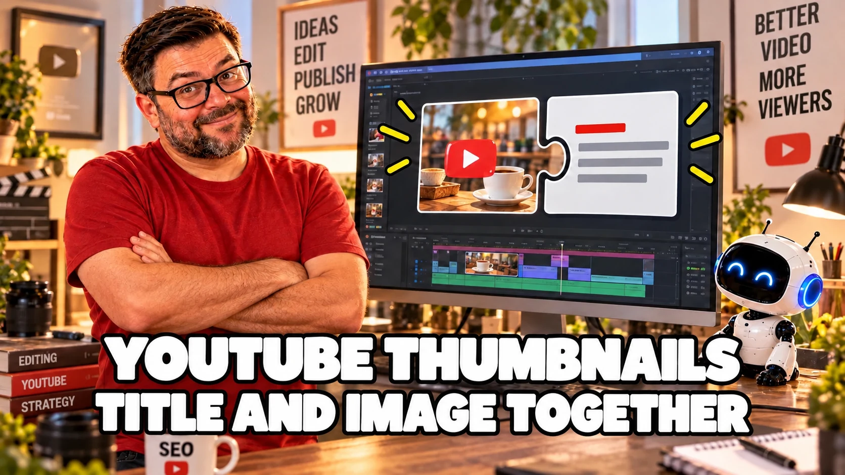
Your thumbnail promises one thing. The title promises another. The video will have to explain the misunderstanding.
A shiny coffee maker can advertise a recipe, a comparison or a cleaning guide. The photo does not decide for you. If the video teaches how to make coffee, the image and title must help people recognise that answer before they click.
File size matters when uploading it. The clarity of your promise matters if the presentation is to make sense. They are different jobs, even though many guides stop at counting pixels.
Short answer: prepare a simple thumbnail that is clear at a small size and a concise title that represents the video. Check YouTube's current specifications for the device you will upload from. Then compare results in context or use Studio's A/B tests when your video and channel meet the requirements. Getting a click does not, by itself, prove you chose well.
What should the title and thumbnail communicate together?
The same answer, with complementary information. The title can explain what people will learn, while the image can show the object, action or result you will teach.
YouTube recommends that both represent the content accurately in its title and thumbnail tips. It also advises avoiding overly complex designs and using an easy-to-read font when adding text.
You do not need to write the whole title inside the image. If it already says "How to make coffee with a moka pot", repeating those words over the photo may add little. As an editorial approach, I prefer using the image to show the preparation and the title to specify the answer.
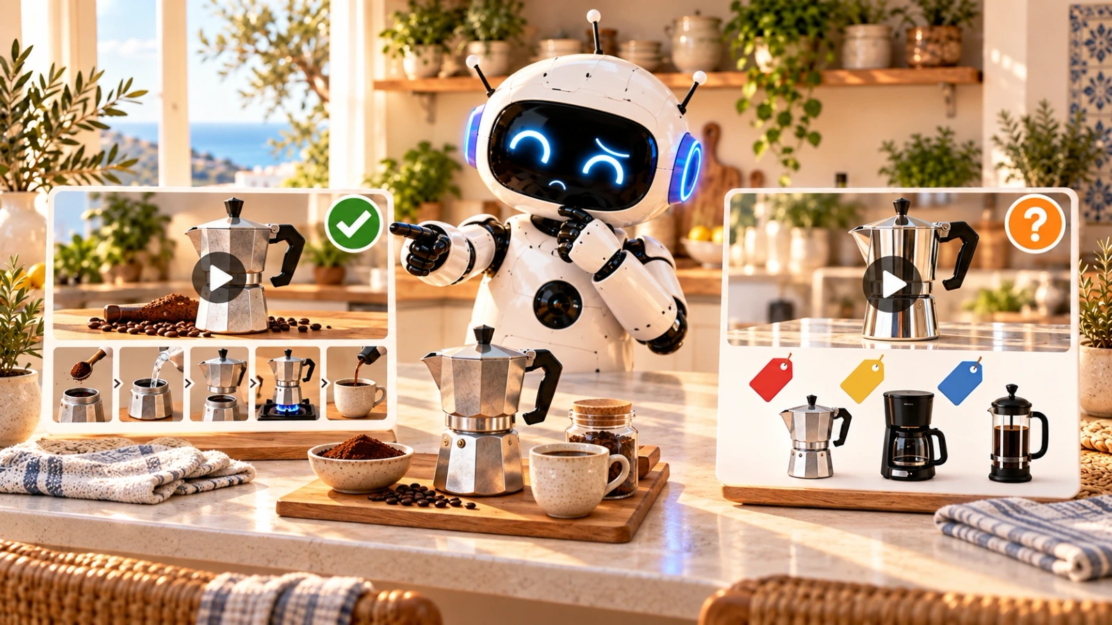
We are still using a hypothetical example, not results from a real channel. A video teaching preparation could use that title and an image of the coffee maker pouring coffee. A thumbnail with three models and price labels would suggest a comparison. It can be a nice image and still present the wrong video.
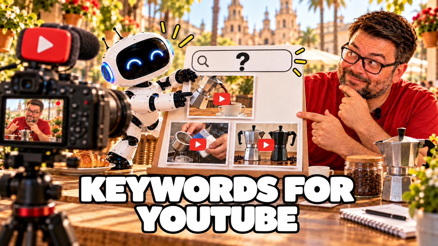
This decision comes after choosing the intent, as I explain in the article on keywords for YouTube. We are not looking for decoration for a word. We are presenting an answer.
What size does a YouTube thumbnail need to be?
For a horizontal video, keep a 16:9 ratio and check the current help before exporting. Do not confuse a recommended resolution with a minimum width or a file-size limit.
The official English help, consulted on 1 November 2026, recommends 3840 × 2160 pixels for videos and a minimum width of 640 pixels. It lists JPG or PNG and distinguishes limits according to the upload device.
On that page, the desktop limit is 50 MB for video, Shorts and podcast thumbnails. On mobile, it lists 2 MB for videos and 10 MB for podcasts. For podcast playlists, it recommends a square 1:1 ratio, different from a horizontal video thumbnail.
One detail is worth recording: at the time of this review, the Spanish translation of the same help still shows the previous 1280 × 720 recommendation and limits of 2 MB for videos and 10 MB for podcasts, without that device distinction.
That does not mean a 1280 × 720 thumbnail is invalid. It means the documentation versions are not aligned. When preparing a new file, use the consulted English recommendation as your reference and check what your upload screen accepts. If you work with a large design, you can export a lighter copy for mobile without distorting the image.
This guide focuses on horizontal long-form videos. Shorts, vertical videos and podcast playlists have their own format and presentation details. Do not reuse their rules as though every surface were the same.
How do you know whether the thumbnail works at a small size?
Reduce the image and check what remains. Seeing it full-screen in your design software is not enough.
The YouTube guide reminds us that thumbnails appear differently depending on the device. It recommends a composition that is not too complex and readable text where there is any.
A practical review can use these questions:
- Can you recognise the main object or action?
- Is one element in charge, or are five things competing for attention?
- Can you read the text without zooming in?
- Does the image add something to the title?
- Does what is shown actually appear in the video?
These are not measured ranking factors or a universal design recipe. They are an editorial check to detect a confusing presentation before uploading.
In our example, the coffee maker and coffee may be enough. Adding an arrow, six words, a surprised face, three models and a cloud of steam does not guarantee a clearer answer. The file will still have plenty of pixels. The idea may run out of space.

How do you write a title that represents the video?
Explain the answer and put important information early. YouTube advises accurate, concise titles because viewers may see only part of them. Its official tips also recommend leaving branding and episode numbers until the end and limiting capitals and emojis.
You can start with three pieces: what you will solve, whom it helps and which limit you need to clarify. You do not need to include them all if they make the title heavy.
For the hypothetical preparation video, "How to make coffee in a moka pot" explains the task. "The coffee maker that will change your life" promises much more and does not say what the recording teaches. An intriguing phrase is not forbidden for being intriguing; it needs to be faithful to what viewers will find.
YouTube distinguishes between titles easily found through search and titles that spark curiosity. Choose according to the content and how you expect people to discover it. Do not turn that distinction into an obligation to write the same type of title every time.
There is no need to insert every variation from your research either. Different terms for a thumbnail do not all need to appear together to prove you opened a tool. People need to understand the video, not review your keyword list.
How do you prepare several options without changing the promise?
Change the presentation, not the content you advertise. You can test a more visible action, different framing or a title that makes the answer more specific.
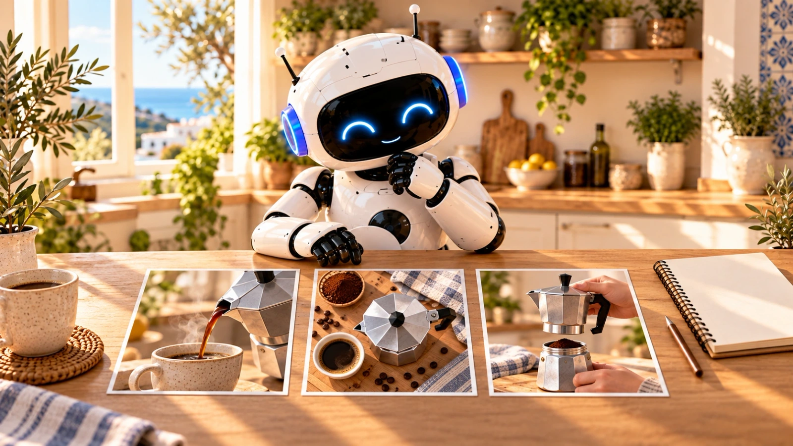
For the same preparation video, three images could show coffee pouring, the coffee maker with a cup or an assembly step visible in the recording. These are composition suggestions. We are not saying one achieved more clicks or watch time.
Before testing them, record which difference you want to evaluate. "The result is easier to see" explains a decision. "I like this one more" is a valid preference, but it is not performance data.
If you also change the title, record which combination you prepared. Testing combinations can help choose a presentation, but does not automatically attribute the whole result to one image detail.
What can you check with YouTube A/B tests?
The current A/B testing feature lets you compare up to three titles, thumbnails or combinations of both. It is used in YouTube Studio on a computer and requires advanced features to be enabled.
The help also sets limits. It is not available for Shorts, scheduled live streams or premieres not yet converted into long-form videos. It excludes private, made-for-kids and age-restricted videos. Do not promise that any channel can use it on any video.
YouTube says a test can take from a few days to two weeks. Its result is based on watch time, not only click-through rate. There may be a winner, similar performance or an inconclusive result.
An inconclusive result does not prove your three designs are bad. The help itself says there may be insufficient difference between options or too few impressions to distinguish them. Avoid inventing a winner because one card has a slightly higher number.
If you change the title or thumbnail during the test, it stops and you need to restart it. Prepare the options first, check that they represent the same video and record what you wanted to learn.
What does CTR mean, and when does comparison make sense?
Impressions CTR measures how often a video was watched after an impression counted on YouTube. It does not include every route to the video. That is why it is not calculated by dividing all views by all impressions, as the official FAQ explains.
The same source explains that it varies with the content, audience and where the thumbnail appeared. Comparing search with the home page as though they were the same display can lead to the wrong conclusion.
Look at comparable periods and sources. Do not change the whole presentation over a small variation just after publishing. An isolated percentage does not tell you who saw the image or what happened after the click.
Changing a thumbnail does not magically reset rankings either. According to the official discovery explanation, the systems may respond to different viewer engagement, not simply to the act of editing the title or image.
What questions often come up when preparing a thumbnail?
Do I have to put text inside the image?
Not as a general requirement. If you add it, it must be readable and help people understand the presentation. YouTube recommends avoiding an overly complicated design, not filling a fixed word count.
Has 1280 × 720 stopped working?
We cannot conclude that from the current recommendation. The English help recommends higher resolution but keeps a minimum width of 640 pixels. Here, we distinguish between recommendation, minimum and file size.
Does a higher CTR mean the thumbnail is better?
Not by itself. Review the audience, traffic source and what happens after the click. YouTube's native tests prioritise watch time when choosing their result.
A workbook for your next test
You can use the YouTube SEO workbook we already have to record intent, presentation and your next test. Also review the YouTube SEO guide to keep this decision within the video's wider preparation.
To finish the coffee
A thumbnail can be perfectly exported and present the wrong video. First, check what it promises together with the title. Then review size, readability and format.
Prepare options for a reason, keep the context of their results and accept that some tests will not give a clear answer. The job is not to make everyone click. It is to present clearly what you will deliver to people who are interested.
The next step will be looking at what happened after the click. That is where YouTube Analytics comes in: traffic sources and context before choosing the next change.
Sources last checked: 1 November 2026.